ShopDreamUp AI ArtDreamUp

Deviation Actions


Suggested Deviants


Suggested Collections


You Might Like…


Description
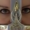
Prize art for  , for winning second place in the literature category of our
  group's winter contest!
He asked me to depict his OC Akataras, whose story sounds really interesting (at least from the short story he submitted in the contest!). As the references provided where screenies from a game and a written description, I hope I did him justice. (Smile)") I hope you enjoy!
I hope you enjoy!
Akataras (c) ~AnImperfectDream
Art (c) *PhaeOBrien
©All rights reserved.
My artwork is my intellectual property and is under copyright. Nothing is to be used in any way without my written or otherwise permission. You cannot publish, edit, reproduce, upload, etc. Click here for detailed permissions and terms.
, for winning second place in the literature category of our group's winter contest! He asked me to depict his OC Akataras, whose story sounds really interesting (at least from the short story he submitted in the contest!). As the references provided where screenies from a game and a written description, I hope I did him justice.
Akataras (c) ~AnImperfectDream
Art (c) *PhaeOBrien
©All rights reserved.
My artwork is my intellectual property and is under copyright. Nothing is to be used in any way without my written or otherwise permission. You cannot publish, edit, reproduce, upload, etc. Click here for detailed permissions and terms.
Image size
2480x3508px 678.84 KB
Comments5
Join the community to add your comment. Already a deviant? Log In
The reaction I had when I saw this drawing was roughly the same as when I read the stories that corresponded with it: an exciting premise, but plenty of room for improvement. I don’t recall a single elve character from LOTR who had a scar like that (Warcraft, perhaps though), so the idea of the bastard prince is actually quite interesting. The face in your sketch looks similar enough to “Azyriel Portrait” (stunning image btw, 5 stars) that one could believe this was her son (and now I’m kind of curious about what the father looked like). The face was well proportioned, better so might I add, than the way a lot of my own character sketches are depicted, and I also like what you did with the hair, although I’m not quite sure what is going on just above the ear to my left (a braid, perhaps?). You also handled the lines around the face quite well. A lot of times when I’m trying to draw characters I make the lines too thick, especially between the cheek and where the mouth is, as well as those two lines linking the center of the mouth which results in my characters looking older than I originally intended. You, on the other hand, obviously do not have that problem. An outfit and some kind of background would have been nice, but if you were just going by a “perfection when nothing is left to take away” approach, I would say that you did quite well. By the way, if you are planning to paint over it I would love to see the various stages of the process. I am planning to do something similar with my own characters in the future, so it would be cool to see how someone else does it
If it had not been for the visual art that preceded “The Prince and the Queen,” “Louder Than Thunder,” and “Something Very Special” I don’t think I would have had the same experience from just reading the text. The descriptive language was not as well hashed out as it could have been, although I would not go so far as to say that it was completely minimalistic. “On These Lost Wings” and “Swords and Sand” were both good poems (4 stars each), but the kind of experience that they succeeded in conveying was somehow lost once I actually got into the narratives. But that isn’t to say that the stories themselves are intrinsically flawed. “The Hunger Games” wasn’t exactly a 5 star read either, but once it was fully brought to life as a film it became one of the best movies of the year
If it had not been for the visual art that preceded “The Prince and the Queen,” “Louder Than Thunder,” and “Something Very Special” I don’t think I would have had the same experience from just reading the text. The descriptive language was not as well hashed out as it could have been, although I would not go so far as to say that it was completely minimalistic. “On These Lost Wings” and “Swords and Sand” were both good poems (4 stars each), but the kind of experience that they succeeded in conveying was somehow lost once I actually got into the narratives. But that isn’t to say that the stories themselves are intrinsically flawed. “The Hunger Games” wasn’t exactly a 5 star read either, but once it was fully brought to life as a film it became one of the best movies of the year